La Granja de Lola
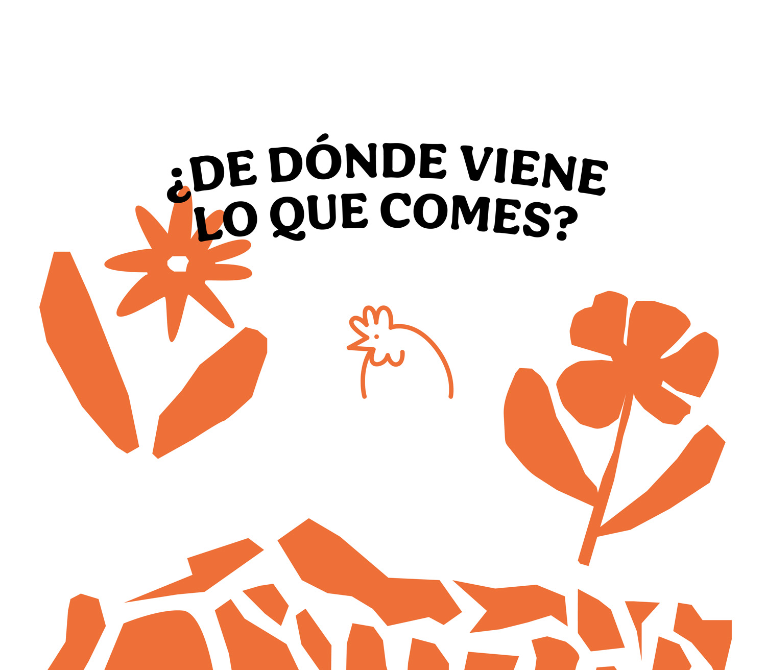
La granja de Lola is a family project focused on creating spaces that encourage healthier living through sustainable food production using regenerative agriculture. The brand is committed to promoting conscious eating, informing its consumers about the origin of its products. This space is characterized by its transparency and constant evolution, demonstrating that it is possible to grow in a way that respects nature.
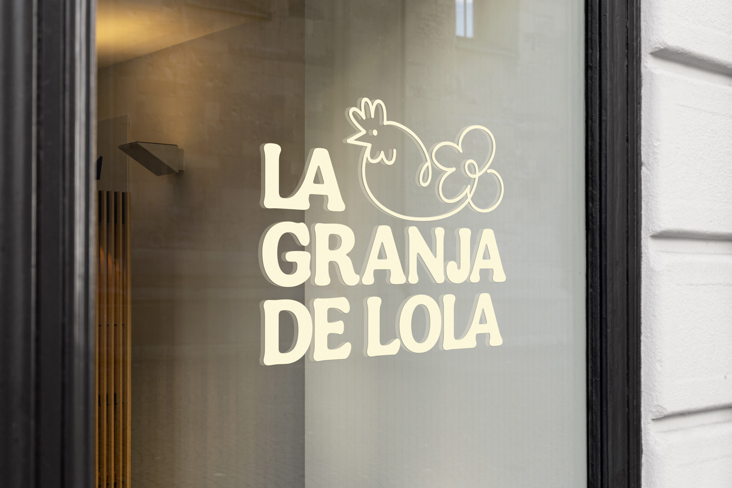
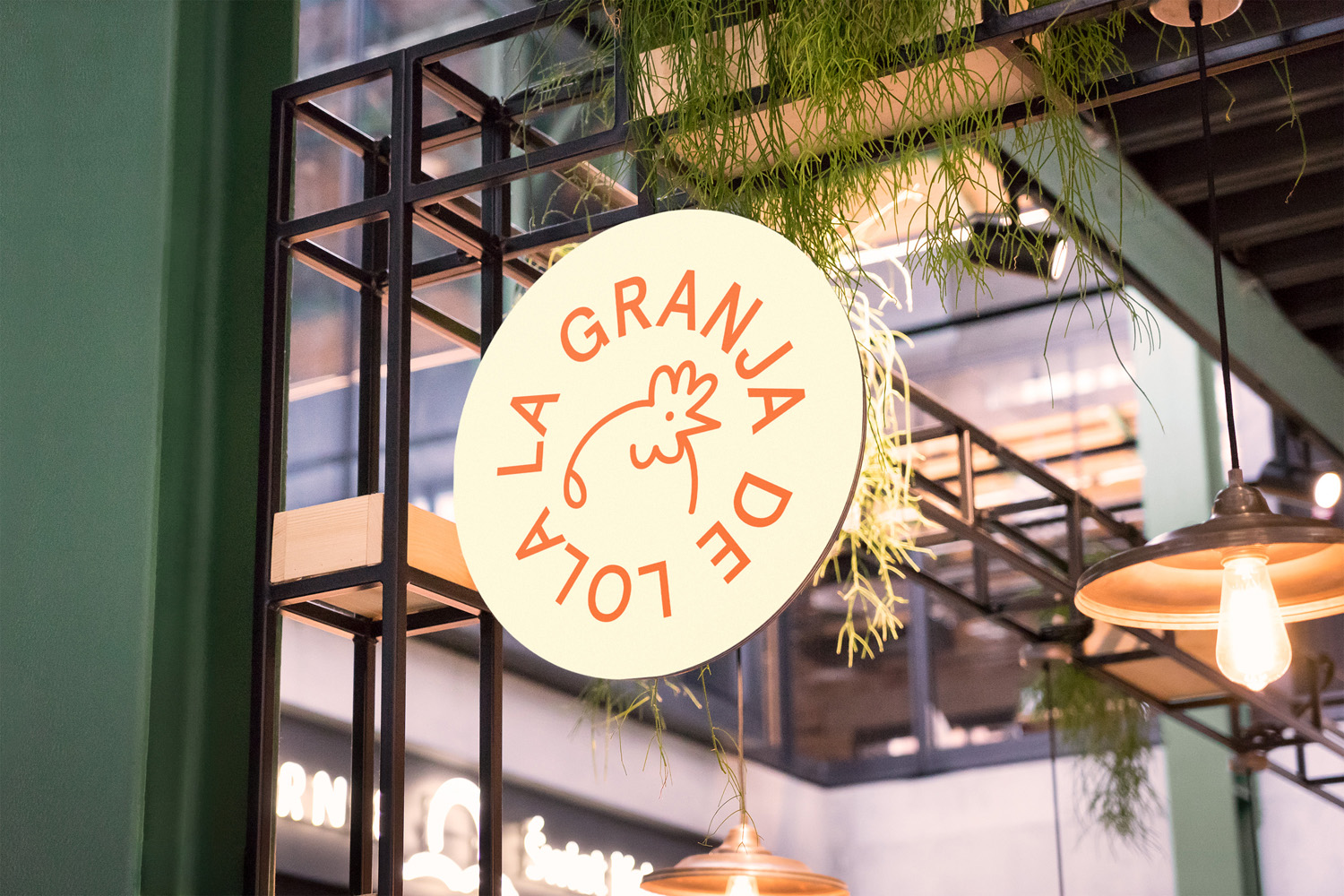
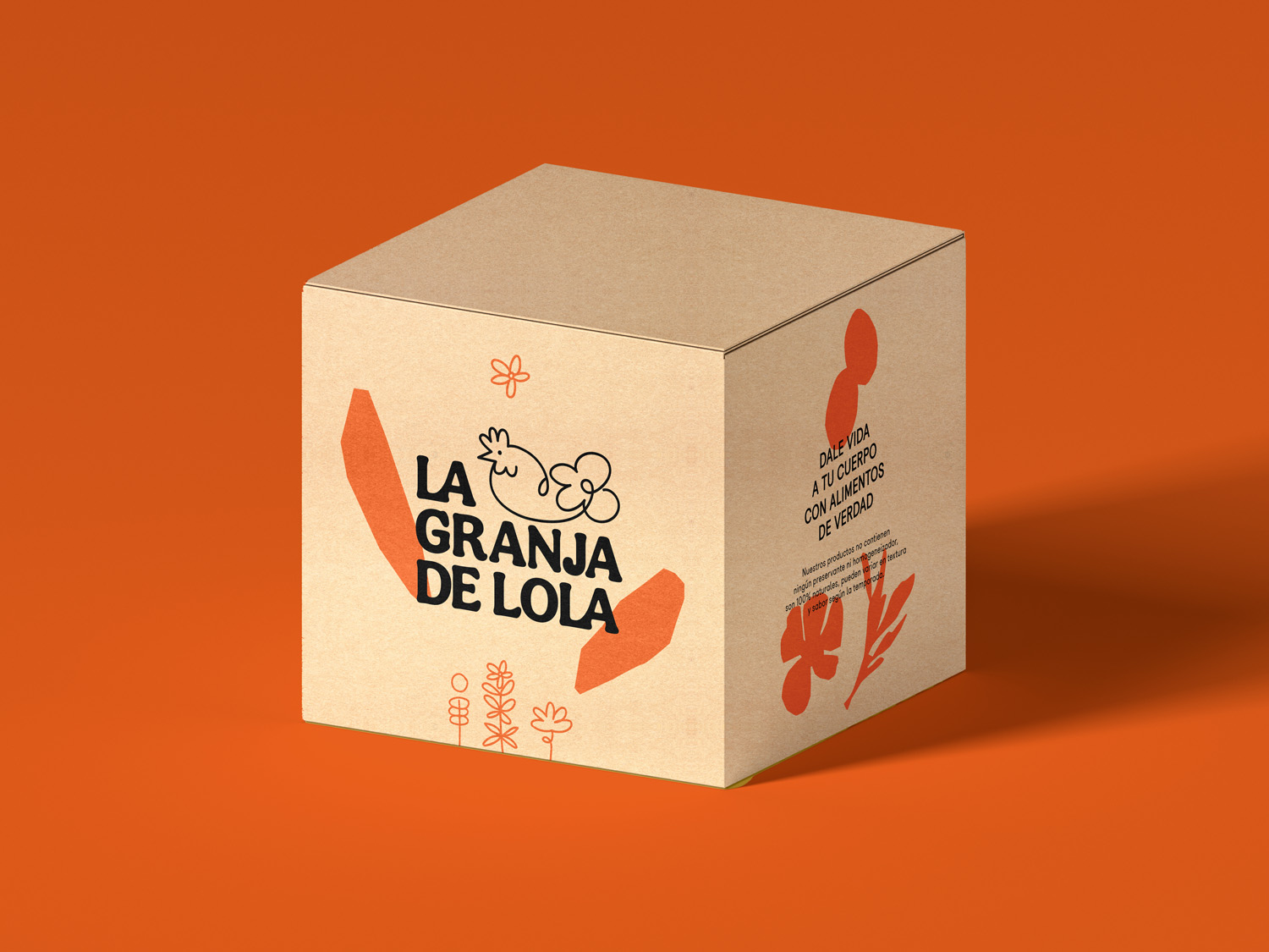
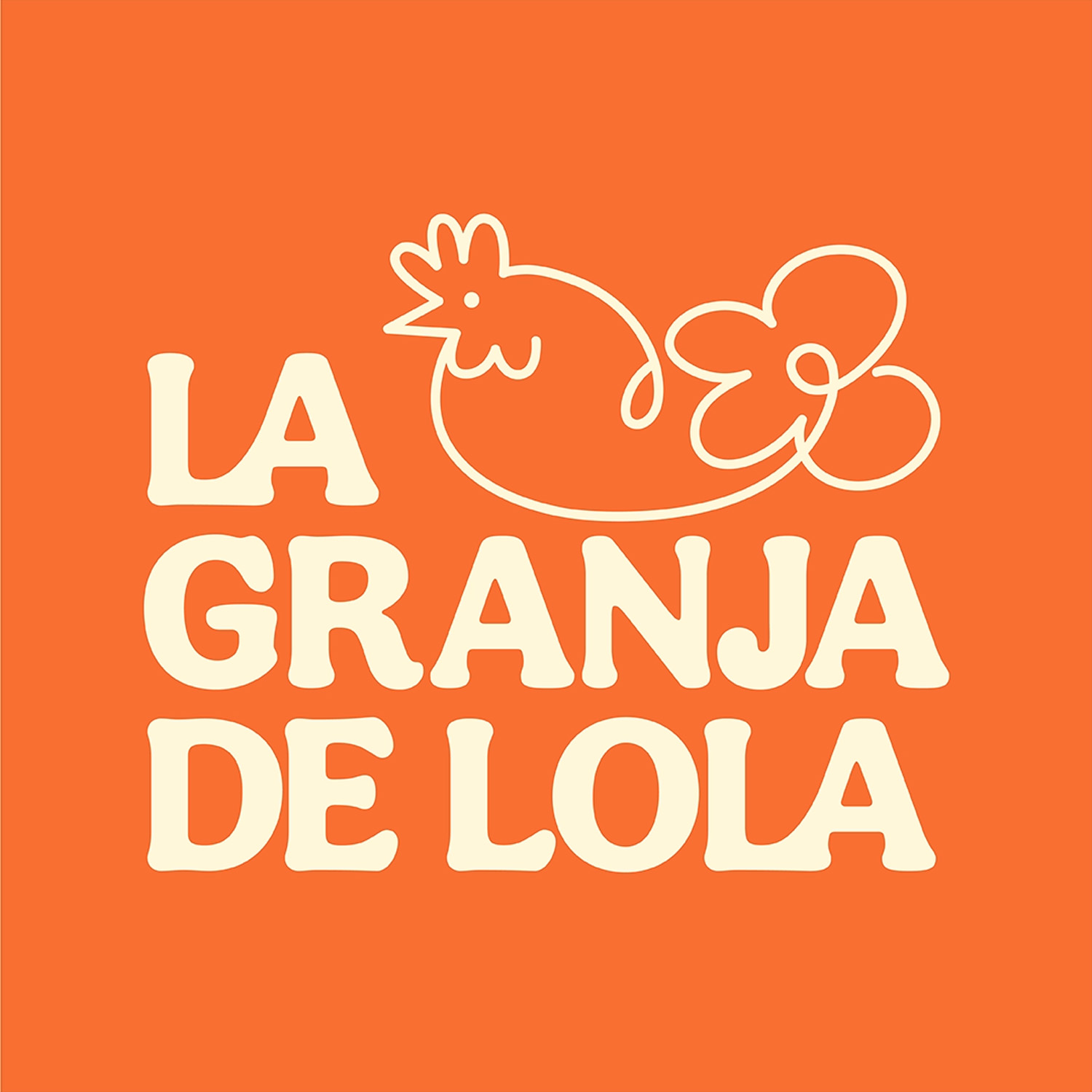
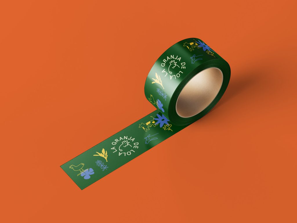
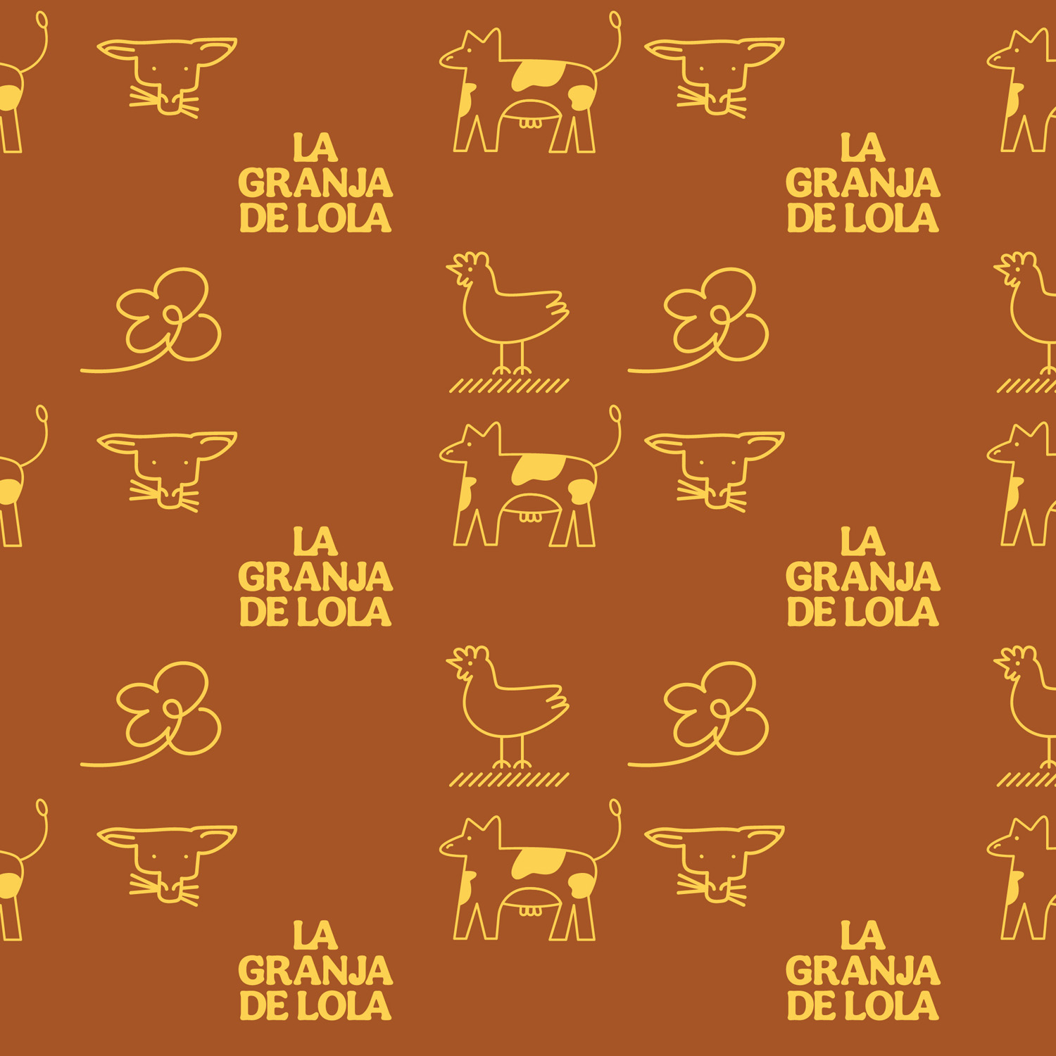
The graphic identity consists of a main icon that represents regenerative agriculture and a selection of friendly and versatile typographies that symbolize the freshness and accessibility of the brand. It is also accompanied by a color palette that suggests the elements of nature and the conscious values found on the farm.
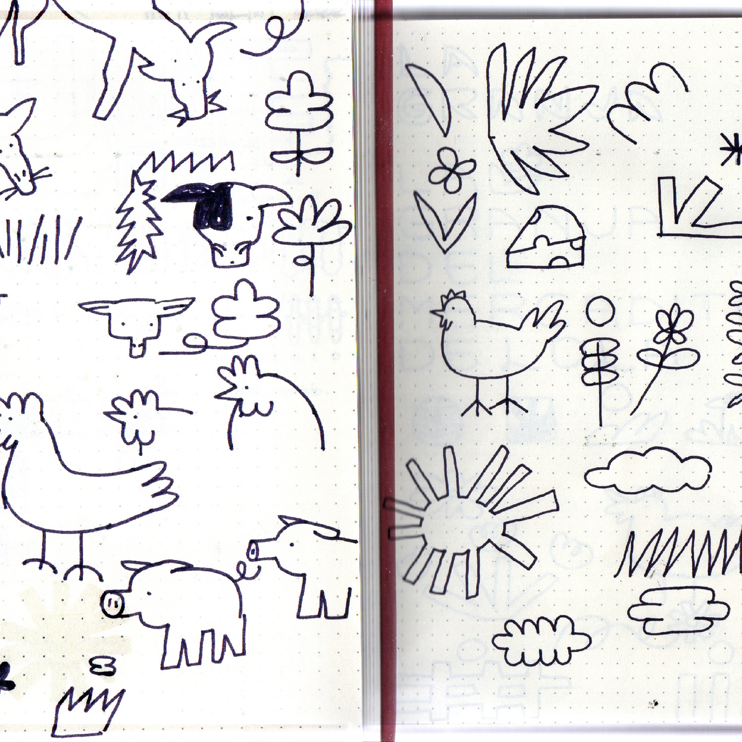
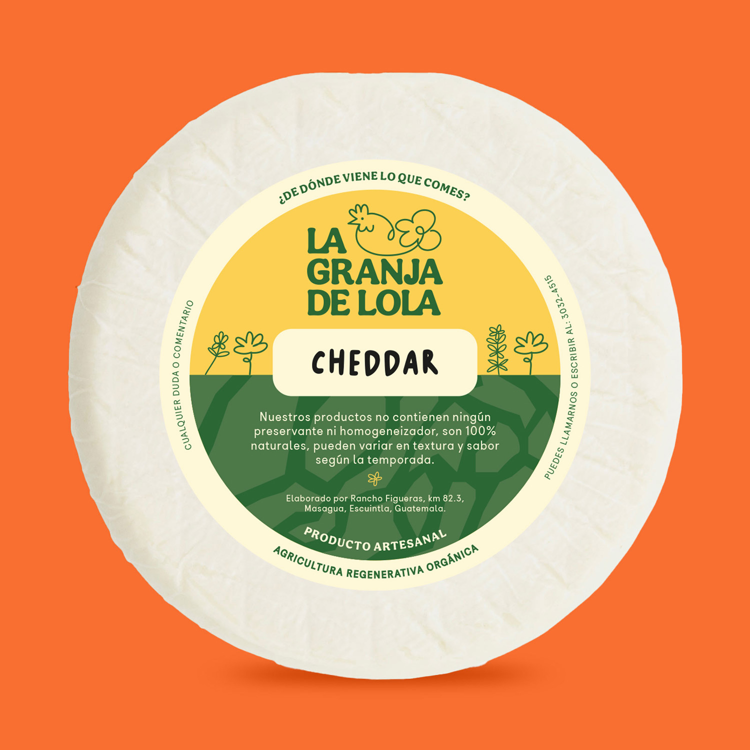
The icon was born from a visit to the farm, in which the importance of chickens in all processes of soil regeneration and pest control is recognized. For this reason, the icon is configured from 2 elements: the hen as a symbol of regenerative agriculture and the flower that represents the vegetables, which are the result of the work of the hens in the soil.
In addition to the main logo, complementary graphic elements have been created to represent the different animals and vegetables of the farm, which can be used as stickers, thus enriching the visual identity of the project.
Creative direction: Marié Sierra
Production: María Alejandra Zamora Peñate
Packaging design: Vekis Morales